Showing posts with label References. Show all posts
Showing posts with label References. Show all posts
Sunday, 11 March 2018

Friday, 9 March 2018
Gravity falls Forest scene comparison
For my Forrest scene in my production i once again referenced Gravity Falls, There simplistic yet effective style to forrests is what i want to try achieve, they have the right sense of depth to there artwork aswell as the small little details which make the image stand out.
The bottom image is what i refenced my composition around, the way they staged the image with the tree in the foreground works perfectly i feel it keeps the audiences eyes engaged into the scene.


 Gravity Falls
Michael O'Brien
Thursday, 8 March 2018
Mountain Range dynamic shot comparison
For my wide shot of the mountains in my project i referenced a lot of Disney's Gravity Falls. The simplistic sillohette shapes gives a great dynamic style to the image. I love the way the mountains and the trees colour pallets fade brighter as they approach the horizon of the image, i tried to recreate this style style in my mountains in my image fading towards the moon over the mountains showing sunlight on the further back mountains.
 Gravity Falls


Michael O'Brien
Wednesday, 7 March 2018
Scene 1 establishing shot comparison
For my opening scene of the establishing shot of the pub exterior, once again, in trying to stick to the same style for the movie throughout i referenced Javier Pineda's portfolio "The Pubs", the pallet and style of the building he has in this image is the look i am trying to achieve with my background showcase. I particularily the simplistic windows to the pub i feel it makes your focus on the little details in the image instead of all the windows. I have not yet added a colour pallet to my image fully.
The image below is an idea from Disney's "Art in the Hole" from 1955, from this image I structured my composition around. The way the water splits the screen for the viewers eye to follow i think is perfect, Also the Rock at the foreground and the mountains in the background give a great depth of feel to the image make it feel like the environment is as big as intended by the artist, i am trying to recreate this composition technique using the shrubs in the forground and the mountains in the background of my image.
The image below is an idea from Disney's "Art in the Hole" from 1955, from this image I structured my composition around. The way the water splits the screen for the viewers eye to follow i think is perfect, Also the Rock at the foreground and the mountains in the background give a great depth of feel to the image make it feel like the environment is as big as intended by the artist, i am trying to recreate this composition technique using the shrubs in the forground and the mountains in the background of my image.
 Javier Pineda
 Michael O'Brien
 Disney, Art in the hole
Colour pallet progress work
For the colour pallet for my city background i referenced Javier Pineda's "Pubs" portfolio, i feel for the time of day i want in my scene this was the perfect pallet to achieve this. I added my own swing to the pallet style turning the browns into more monotone greens to add my own style to the image. In Javier's work i love the way he has positioned the shadows giving a quite shallow depth of feel up the alley and i feel this effect will work well in my project also with the street being narrowed in by the backdrop building's.
 Javier Pineda
 Michael O'Brien
Friday, 23 February 2018
1 point perspective sketch
A rough layout sketch of my 1 point perspective from my city scene in my major film. I am gathering reference images of city shots with little detail, i like the idea of a well constructed shot with just enough detail to make the image look clear and compositioned correctly.

Inspiration
For inspiration for my city shots in my major project i have been looking at work from Javier Pinede, Javier is the lead background designer of The Simpsons, his style varies from perfect perspective shots to warped styilized shots depending on what project he is working on at the time, in this project he did of New York i really like the simplistic but clean style, i tried to emulate the style towards my own city shot i am creating. The smooth but suttle black outlines to the buildings is the part to me that makes the image stand out and look so natural, i tried to use this style on a outline sketch i did of my city shot seen below.


Tuesday, 14 November 2017
Peter Mcverry Trust Style
This is the style of animation i would like to experiment between transitions and scenes in my animation. I think it would work really well with my idea for the Peter Mcverry Trust video
Wednesday, 8 November 2017


Tuesday, 7 November 2017
Thesis References on Composition
http://home.fa.utl.pt/~cfig/Anima%E7%E3o%20e%20Cinema/Realiza%E7%E3o%20Cinematogr%E1fica/Grammar%20of%20the%20Shot%20-%20Roy%20Thompson.pdf
Link to Roy Thompsons second edition of 'Grammer of the Shot'
In this book Roy Thompson Discusses The importance of composition in movies and discusses what effect certain shots can have on the outcome of a movie or scene.
http://www.ebook777.com/framed-ink-drawing-composition-visual-storytellers/
Link to Marcos Mateu-Mestre's book Framed Ink
In this book Marcos discusses lighting effects in composition and comic style close ups and the importance of these shots.
http://www.novedadesaltera.com/picture/picture-composition.pdf
Link to Peter Wards book Picture Composition
In this book Peter also discusses different angle and how to get the right feeling you want your scene to portray from these camera angles.
Link to Roy Thompsons second edition of 'Grammer of the Shot'
In this book Roy Thompson Discusses The importance of composition in movies and discusses what effect certain shots can have on the outcome of a movie or scene.
http://www.ebook777.com/framed-ink-drawing-composition-visual-storytellers/
Link to Marcos Mateu-Mestre's book Framed Ink
In this book Marcos discusses lighting effects in composition and comic style close ups and the importance of these shots.
http://www.novedadesaltera.com/picture/picture-composition.pdf
Link to Peter Wards book Picture Composition
In this book Peter also discusses different angle and how to get the right feeling you want your scene to portray from these camera angles.
Wednesday, 25 October 2017
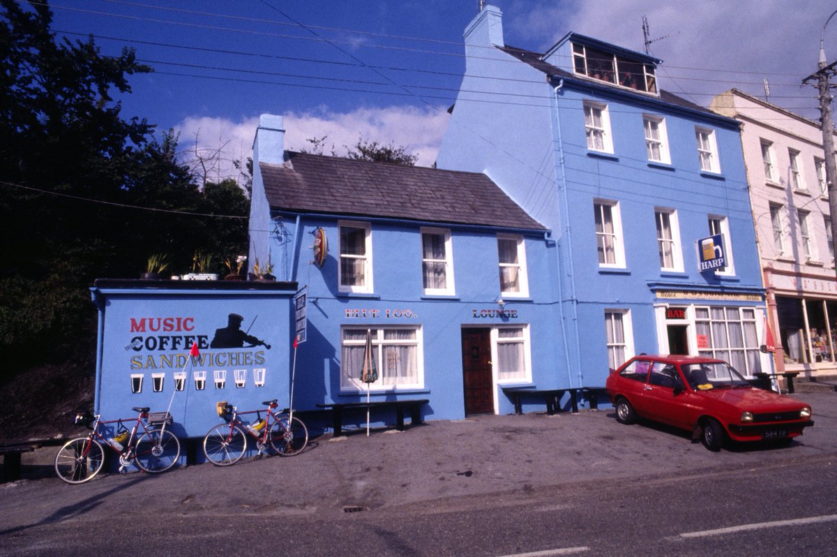
Bar / restaurent / cottage references
Some reference images of pubs and cottages around Ireland for the exterior of my pub / restaurant in my movie.
I like the idea of an old fashioned cottage style pub / restaurant for the exterior of the pub in my movie.


Bar / restaurant interior refences
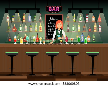
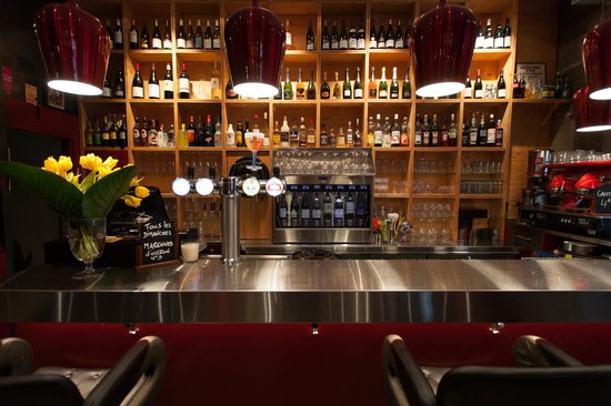
Some reference ideas for the interior of the restaurant / pub in my movie.
I like the idea of an old fashioned pub interior with spotlights shining on the bottles on the shelves and old fashioned bar stools at he bar counter.
I also like the idea of a dull bar with the only lights coming from lamps and spotlights.




Wednesday, 18 October 2017
Arlan Jewell references
Arlan Jewell has worked on some major Animations from the Simpsons to the new animated Netflix original Big Mouth.
Arlan's art is also quite simple but it works perfectly for the style i would like in my animation.


These are some reference images from a background designer Javier Pinada.
Javier Pinada has worked on some of the biggest animations in the world from The Simpsons and Family Guy to Avatar The Last Airbender. I really like his simplistic but effective style it makes the backgrounds really stand out in the animations he has worked on.
Subscribe to:
Posts (Atom)

-
 New Business card design, I used a background from my major project for the front then i went for a more formal look on the back with m...
 -
 For my 7th scene in my film, the idea was to use the frame within a frame compositional trait, the frame within a frame composition cho...
 -
 My 5th scene of my film was split into two sequences, A forrest sequence and a mountain sequence, i wanted to try and create a seamless tra...